Thursday, October 29, 2020

Beauty of math graphs - 3, Phase plane


From: Introduction to Computational Physics
http://astro.physics.ncsu.edu/urca/course_files/Lesson16/index.html  


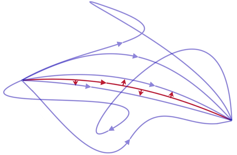
Some Comments from artistic view points.

1. The first one is most beautiful to me.

Distinct lack and red contrast.
Good composition base on the triangular (just suggesting, not completed)
Mostly Curbs and a little bit straight lines with an arrow. Showing movement explicitly.
Ample space for movement feeling.
A calligraphic flow beauty.

2. The last one is the 2nd best.

Combination of several deformed symmetries - not monotonous symmetries while retain symmetrical beauty.
It shows many small seemingly circular movements as well as some mid size ones in the middle and outer large ones seemingly all connected and combined - showing continuation of flow.

3. The 2nd and 3rd - showing some sketch like incomplete beauty.

4. The beauty is highly likely due to chaos nature as the name of the titles of the two graphs (the1s and the last) - Chaotic Pendulum.

Introduction to Computational Physics says:

"
If chaotic systems where entirely unpredictable, you probably wouldn't have heard so much about them. Their most intriguing features are related to the fact that there are things that can be predicted about these unpredictable systems.

 "

AGG


Tuesday, October 27, 2020

Campsis gradiflora and Thunbergia gradiflora

Wiki describes this plant as

"

Campsis grandiflora, commonly known as the Chinese trumpet vine, is a fast-growing, deciduous creeper with large, orange, trumpet-shaped flowers in summer. It can grow to a height of 10 meters. A native of East Asia.

I made many sketches of Campsis grandiflora this summer (July - Oct, Hong Kong has a much longer summer season) as I saw this follower first time in Hong Kong since 1995 when I moved to Hong Kong. Orange ones remind me of the time when I encountered this flower in Japan first time long time ago and Shanghai, also first time in China about 5 years ago. Both times the day was a very hot summer day and day time. Usually orange. But I happened to find bluish purple ones in September in Hong Kong. The best sketch is below.


Bluish purple ones


After checking I found (actually happened to find) this bluish purple Campsis gradiflora is not Campsis gradiflora but Thunbergia gradiflora and belongs to Acanthacea familiy not to Bigoniaceae family (to which Campsis gradiflora bekongs)


Orange ones (Campsis gradiflora)


AAG

Friday, August 28, 2020

Gradation beauty in Chinese paintings


Making gradation beauty in Chinese paintings is easy with one stroke. When you use a Chinese painting brush (soft one) and Chinese ink with water. No particular technique is required. One stroke at one place is usually better than adding the 2nd and 3rd strokes at the same place.


Cheap Paint Brushes, Buy Directly from China Suppliers:5 Styles Chinese Calligraphy Brush Pen Goat Hair Bamboo Shaft Paint Brush Art Stationary Oil Painting Brush Enjoy ✓Free Shipping Worldwide! ✓Limited Time Sale ✓Easy Return.

https://www.pinterest.com/pin/188166090668787172/

Pay attention how a big brush is hold by hand (fingers). In this way you must use an arm not a hand or tips of the fingers to move a big brush on paper. There are many different ways to hold different kinds of brushes (big and small, hard and soft, etc) as well as how to move a bush - many combinations bringing many different effects.


Abstract painted ink strokes set. Stock Photo - 11312193


https://www.123rf.com/photo_11312193_abstract-painted-ink-strokes-set-.html


My paintings - gradation was not so intentional (but not none). Mostly naturally and unexpectedly created, rather. This is fun.


ATG

Saturday, August 22, 2020

Beauty of math graphs - 2, Lagrange Multipliers


The graph below shows the famous Lagrange's least action principle. You can see this Wiki "Lagrangian mechanics" too
 

https://www.askamathematician.com/wp-content/uploads/2018/05/LeastAction.jpg


The Lagrangian gives every point on this picture a value and the total along an entire path is the “action”.  The principle of least action says that the path a system will actually take has the least action. 
With this principle, a single Lagrangian can be used to derive many physical laws at once,
so it’s a good candidate for equations that aren’t needlessly complex.

https://www.askamathematician.com/2018/05/q-what-is-the-most-complicated-equation/ 


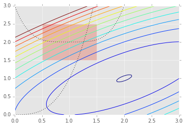
More aesthetically beautiful graphs are fund in "Lagrange Multipliers" related graphs. These graphs can be found easily on the internet "images".

 _images/13_Optimization_5_0.png

http://people.duke.edu/~ccc14/sta-663-2016/13_Optimization.html

_images/BlackBoxOptimization_79_1.png

https://people.duke.edu/~ccc14/sta-663/BlackBoxOptimization.html
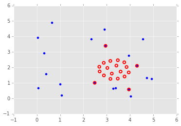

_images/BlackBoxOptimization_107_0.png

https://people.duke.edu/~ccc14/sta-663/BlackBoxOptimization.html


I never studied "Lagrange Multipliers" and highly likely will no study much either though I want to know why "multipliers" is used. "Lagrange Multipliers", very simply put it,  seems

"

https://tutorial.math.lamar.edu/classes/calciii/lagrangemultipliers.aspx

Section 3-5 : Lagrange Multipliers

In the previous section we optimized (i.e. found the absolute extrema) a function on a region that contained its boundary. Finding potential optimal points in the interior of the region isn’t too bad in general, all that we needed to do was find the critical points and plug them into the function. However, as we saw in the examples finding potential optimal points on the boundary was often a fairly long and messy process.

In this section we are going to take a look at another way of optimizing a function subject to given constraint(s). The constraint(s) may be the equation(s) that describe the boundary of a region although in this section we won’t concentrate on those types of problems since this method just requires a general constraint and doesn’t really care where the constraint came from.

"

And the graphs made according to this (shown above) are quite beautiful.

The underlined parts which I made can be paraphrased as

Ways of optimizing a function subject to given constraint(s).

This can be applied to our daily life or our hole life as well as paintings. Analogously 

How to optimize your paining under certain restrictions given which you cannot control.

In another words, at least a Chinese style painting

Optimize the composition and optimize the use of Contrasts.

We can find many Contrasts in the above three graphs.

Curves - Straight lines (1st and 2nd)
Circles (deformed) - Rectangular (2nd)
Dense and Rare (2nd ad 3rd)

One big difference is

Painting is to represent 3D objects in 2D (on paper) so the crossing is generally impossible.

 Apples and oranges (Wiki)

This is a photo not painting but if you make a sketch your sketch will be like this. An apple and a orange cannot crossed physically, one is front and the other is behind. One the other hand the crossing points of the above math graphs mean that two different functions have the same values at these crossing points and some meanings.


<Front and Behind>is a contrast and exhibits an effect indicating 3D. This picture also shows the following contrasts:


Small and Big
Green and Orange in color
Light ad Shade (this exhibits 3D effect too).

In paintings besides the above <Front and Behind >and <Light ad Shade >there is a systematic way to make 3D effect on 2D paper,  "perspective"  which was developed in Europe.

There are some ways to show 3D on paper in mathematics. 

1) x-y-z axis
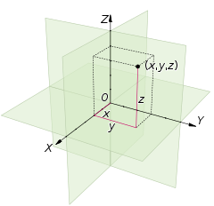


Wiki: Cartesian coordinate system

Not very common and not so visually effective as 1) x-y-z axis there is another way called "Contour Lines". You ca see these lines in a 2D map, especially a map of mountains. The mountain shape is never simple so is its contour lines. Contour lines show some beauty so do mountains.


Constrained Min/Max

http://web.mit.edu/wwmath/vectorc/minmax/constrained.html

The 2nd graph of "Lagrange Multipliers" exhibits beauty of contour lines.

Another commonly seen contour lines are those of whether forecast atmospheric pressure.


http://rubenmontanemapcatalog.blogspot.com/2012/03/isobar.html
http://stormeyes.org/pietrycha/vortex/floyd/floydtornadoes.html

Meteorology 

a line on a map connecting points having the same atmospheric pressure at a given time or on average over a given period.

Rare and dense lines show difference of atmospheric pressures at different locations (or more broadly at every location) and indicate the strength (magnitude) of wind and the direction in some extent. The strength and direction of wind remind me of some ways of showing movement and direction of paintings. In maps arrows showing the directions are commonly used to show the direction. But in painting the use of arrows destroy a beauty of paintings. Movement and direction should be express in some other ways than explicit arrows. The use of the contrast of rare and dense lines is one way as shown in the above weather map. The broad line with small triangles has some meaning in the weather map but it also gives a certain effect when you see this as a painting.

Contrasts of

One distinctive broad line - many rare and dense fine lines
Nearly straight lines - curve and circle lines

 
AAG


Tuesday, August 18, 2020

Beauty of math graphs


Some graphs having mathematical meanings show some beauty, either mathematical one or aesthetic one or both. To appreciate mathematical beauty in a graph you may need some or deep mathematical knowledge. To appreciate purely aesthetic beauty in a graph you do not have mathematical knowledge but should have some sense of art beauty. Most Westerners may find beauty in symmetric graphs while most Oriental people, especially Chinese and Japanese (maybe some other countries and regions too) people can find beauty in asymmetric graphs more than in symmetric ones. Chinese painting theory often refer to the beauty derived from Contrast - which is usually asymmetric. Let's see some examples. 

"


y=xsin(1/x)


From: What is the most aesthetically beautiful graph/surface in mathematics, topology, etc.?
https://www.quora.com/What-is-the-most-aesthetically-beautiful-graph-surface-in-mathematics-topology-etc
"
My comment
This is symmetrical but also shows Contrasts of Dense and Rare and Small and Large. Quite beautiful for me.
---------
"
For fun or to create something of beauty.

    The sine function is valuable tool in mathematics and engineering. Its graph is beautiful and an ideal function to use to compose other playful and beautiful functions. Below are two examples.

    In the first composition, 1.5sin(.2x²), the augument of the sine is a flattened parabola which gives the graph symmetry and decreases the "speed" at which the sine goes through its cycle. The multiplication of this by the constant 1.5 gives the function a bit more height compared to the height of the sine function.

In this second composition, the height will continue to grow because the natural log function, seen as ln(x+4), continues to grow and here multiplies the height of the sine.

The curve is shifted to the left by the linear function x+4 seen as the arguments of the natural log and the sine.


From: Composition of Functions
http://www.mathnstuff.com/math/spoken/here/2class/300/fx/comp.htm

"

My comment 

The first simple sin (x) function graph is too monotonous - symmetrical and same frequency (no Contrast of Dense and Rare) and the same size and pattern repeat. The second one is still symmetric but shows Contrast of Dense and Rare though not distinctive. The third graph shows aesthetic beauty in the Oriental way - not symmetrical, showing Contrasts of Dense and Rare and Small and Large. It also indicates direction and movement. These three remind us of wave of course.

---------
"

Gamma graph

http://math2.org/math/integrals/more/gammafun.htm

"

My comment

Very open outwardly while showing some focuses or dead end inwardly at different locations quite irregularly. Quite beautiful in the Oriental way. Not totally closed but show some Contrast of openness and "closedness".

---------
Jump Discontinuity

"

https://d2nchlq0f2u6vy.cloudfront.net/11/08/21/2d6244d07d2900e6da934a6854d5eeb5/a65d7baeb84ca584d7f533bae2dd0fb9/4c182d4cbe3a4e53b1b1c2983075174d.png


https://www.slader.com/discussion/question/sketch-the-graph-of-a-function-f-that-is-continuous-except-for-the-stated-discontinuity-removable-di/#

"

My comment

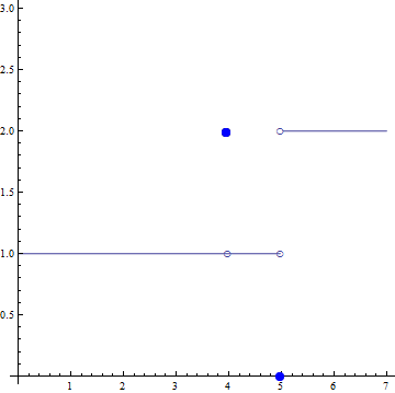
This graph does not show "Jump Discontinuity" distinctively at least to me. The positions of two kind of dots (blue and white) and the long and short straight lines show both contrast as well as symmetry. This exhibits spaces partly closed - openly partitioned. So I can point out the following contrasts, at least.

1) Dots and Lines
2) Dots - Blue ad white
3) Straight lines - long and short
4) Open and closed
5) Continuous and discontinuous
6) Contrast and symmetry

One more thing, which may be the most important contrast in Chinese paintings

 7) Void (虚)and Real(实)

The two Real (can see) lines are horizontal. But when you see the upward jumping discontinuity part you can "feel" or even see in your mind a vertical line. This unseen (Void) vertical line is contrasting the two horizontal real lines. Also we can "feel" or even see the partly closed - openly partitioned spaces (Void).

This is a very attractive graph for me. We cannot neglect the Real x-axis and y-axis to see this graph (also all the other graphs shown in this post). Generally curves are more beautiful than straight line, But the straight line more beautiful than acute angles and spikes. The latter two make people feel fearful and irritated.

---------

Jump Discontinuity - 2

"


Figure 3.4. A function with discontinuities at x=5, x=2, x=1 and x=4.

https://www.sfu.ca/math-coursenotes/Math%20157%20Course%20Notes/sec_ContinuityIVT.html

"

My comment

Now the curves are added to the straight lines. This reminds us of Miro panting.  Dots and lines. Curves are more beautiful than straight lines in this graph too. But straight lines act a factor of Contrast of curves and straight lines.

-------

The beauty of Chinese paintings derives from largely countless combinations of these Contrasts. The other important factor contributing to the beauty of Chinese paintings is composition, which is however not just for Chinese paintings but paintings in general.


This may continue as I have found many attractive math graphs.


AAG


Saturday, August 8, 2020

Twisted Doodle


Doodle is fun. Unexpected effects are created. How to make a sine curve ? It is is easy once you learned both the meaning and technique. 

First you prepare a pen and a piece of paper. You hold a pen with your fingers and put a piece of paper on your desk or a table. You place the pen point on the paper and move your hand or arm (which is better) up and down (vertically) on paper. At the same time you move the the paper from right to left (left to right) horizontally. That is all. You can make and see a beautiful sine curve after you mastering it. Please note the movement involves time.

This technique can be used for Twisted Doodle which I name this method. You can make any movements of your hand (or arm) and paper as you like. Millions of (millions of) different combinations will be made intentionally and unintentionally. If you close your eyes then even more unexpected effects come out. I tried about 50, not a waste of paper as I used mostly the back of the used paper around my desk. The results (good ones) are below:


AAG